Victor Swarovski

UX, Design & Art Direction

Map of the Internet

Peer 1 Hosting and Steamclock Software have created an interactive Map of the Internet app that lets users explore the internet’s infrastructure. The app is designed as a free educational tool for iOS and Android. It displays a global view, a network view, and a chronological view that shows the evolution of the internet from 1994 to today and even predicts what the internet might look like in the future.
  • Business Area: Managed Hosting Services
  • Client: Peer 1 Hosting
  • Objectives: Developing an educational app that visually represents the Internet
  • My Role: Acting as an Art Director, collaborating with contractors and a software agency, participating in ideation and UI design, and creating promotional materials after the launch of the app.

Map of the Internet media coverage logos
Map of the Internet uses data from CAIDa, the Center for Applied Internet Data Analysis, which maps the key ISPs, exchange points, universities, and other organizations that run the Autonomous Systems that route traffic online.
With Map of the Internet, users can also perform a traceroute to a node from your network, search for companies or domains, tap on nodes to learn more about them, and switch between geographic or hierarchical maps.
The app is designed as a free educational tool for iOS and Android. Users can explore where tech giants like Google and Facebook are located, as well as where internet service providers (ISPs), Internet exchange points, universities, and other organizations that route traffic online are.
In Globe view, you get a slowly rotating view of the Earth with the locations of the internet nodes represented as lit circles. The color of the circles show the type of node, while the size shows its relative “size” based on connections. In Network view, the internet comes off looking like an electric jellyfish. The size and height of the nodes represents them bearing more connections.
The Timeline function is available in both Globe and Network views and is based on an algorithm that combines current data and predictions. It's the most entertaining of the features as you see what the internet looked like when the dotcom bubble burst or Youtube started.
This visualization was used in various mediums, including an exhibit at London’s Science Museum.
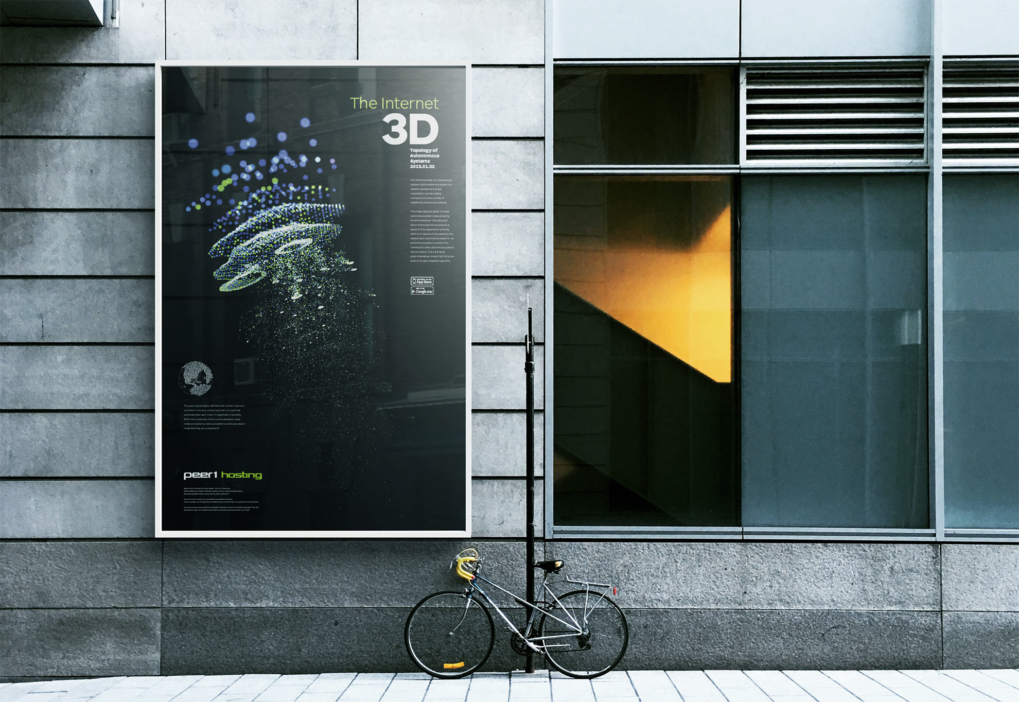
Peer 1 Hosting Map of the Internet street poster
 
The marketing campaign for the Map of the Internet included the creation of materials like a poster, which were used to promote the map and get the word out.
Check out the Map of the Internet poster page to see the origin of this idea. This map was implemented as a wall poster for the SXSW'13 tradeshow event in Austin, TX ( Click here to view the poster page).