Victor Swarovski

UX, Design & Art Direction

Genesis Extended Warranty Page

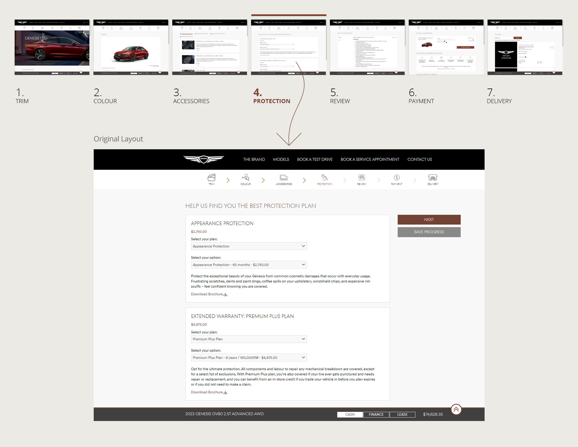
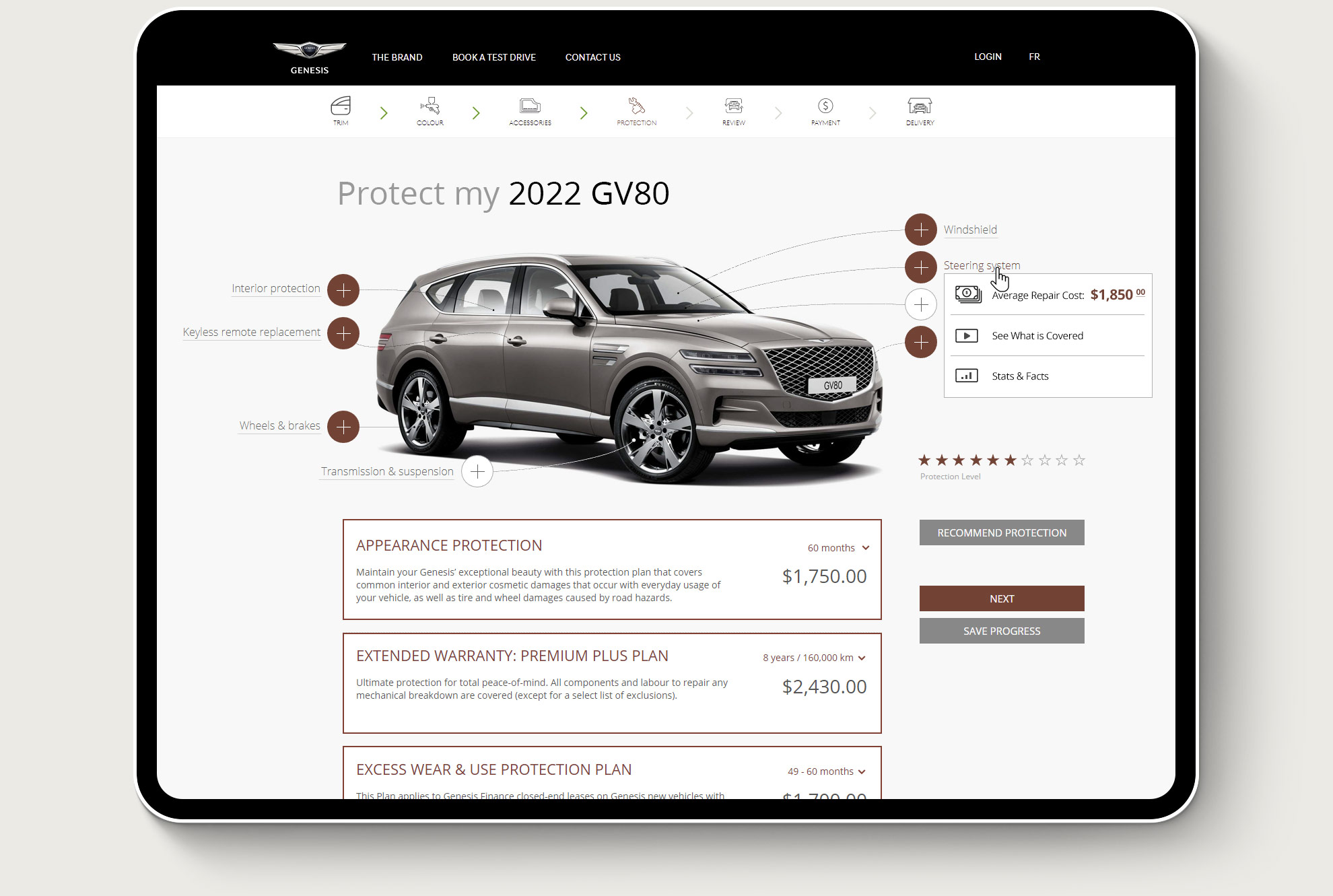
As part of a vehicle online purchase process, LGM Financial partnered with Genesis to create this page to help users identify the car protection they may need for their new vehicle.

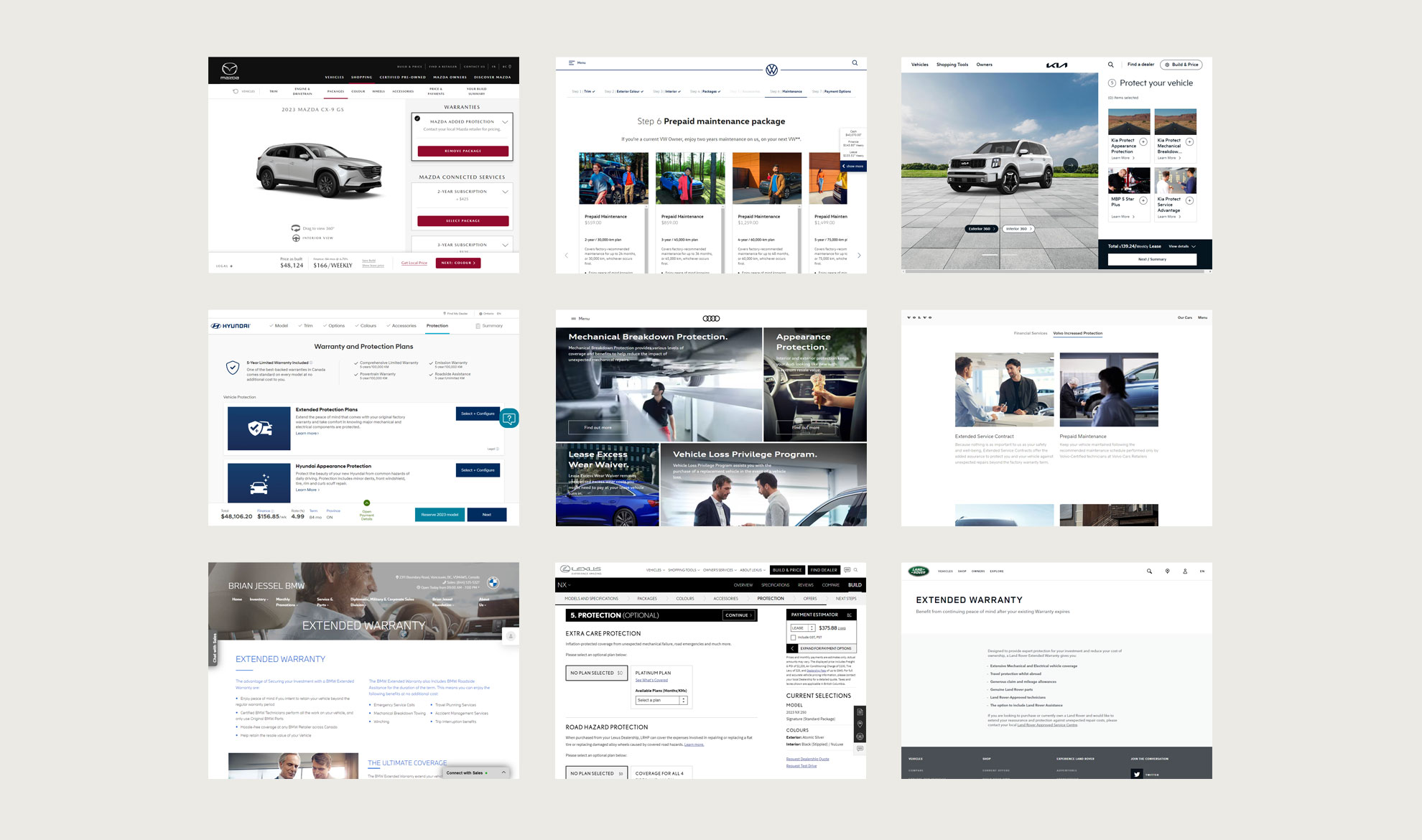
The Extended Protection section of the "Build & Order" page on Genesis's website provides a user-friendly way for customers to determine the best protection options for their new vehicle. Utilizing advanced machine learning algorithms, the page is able to make personalized recommendations based on the buyer's specific needs and preferences.

  • Business Area:Automotive Insurance
  • Client: Genesis, LGM Financial
  • Objectives: Designing a UX/UI prototype for the Genesis website
  • My Role: Conducting research and ideation, presenting the design concept to stakeholders, leading the design process, and collaborating with the development team, creating a clickable prototype to test and refine the design, and ensuring that the prototype is implemented effectively on the website.

Genesis logo
The challenge
The "Build & Order" page on Genesis's website was not providing an optimal user experience for customers interested in purchasing an extended warranty for their vehicle. The original page was too simple and lacked any engagement. The original page had a simple layout for choosing extended warranty options for the vehicle, but this was not engaging or interactive enough for the luxury car market.
Genesis - Build and Order page
The goal
Our goal was to improve the user experience of the " Build & Order" page by creating an interactive and visually appealing way for customers to choose their extended warranty options. We wanted to make the process of choosing protection more engaging and intuitive, while also clearly communicating the level of protection a customer was purchasing.
 
The solution
Our solution was to transform the simple list of offered products into an interactive visual representation, where users could click on different parts of the vehicle to select the protection they desired. To communicate the level of protection being purchased, we introduced a star indicator that changed colour based on the selected protection. This provided customers with a clear understanding of the level of protection they were purchasing and allowed them to make informed decisions.
 
The process
The process of transforming the "Build & Order" page began with conducting competitive analysis to understand the current market landscape and identify areas for improvement.
Competitive Analysis
 
This was followed by a series of user research, prototyping, and testing. During the user testing sessions, we gathered insights from potential customers about their needs and preferences when it comes to purchasing extended warranties for their vehicles. Based on these insights, we created prototypes that incorporated our solution.
User profile
Design concepts
These prototypes were then tested with customers to gather feedback and make further improvements. Finally, after several rounds of refinement, we arrived at the final solution.
 
The results
The UX design incorporated API integration in order to comply with Genesis branding and ensure smooth interaction between the user and the site, and it was designed to fit seamlessly into the existing Genesis web flow while adhering to the Genesis brand.
Genesis UI detail
 
User engagement with the page increased significantly, and users appreciated the level of control and customization it provided. The visual representation of the level of protection also helped users to understand the coverage they were purchasing and made the process of selecting extended warranties much more intuitive and enjoyable. Feedback from users was overwhelmingly positive, with many praising the page for its user-friendliness and innovative design.